Meet ‘Tranquil Dawn’ the Dulux Colour of the Year

There’s always a buzz in the interiors world, when Dulux’s eagerly-awaited new Colour of the Year is announced.
Undated Handout Photo of Dulux Colour of the Year 2020 Tranquil Dawn and the Play Palette: Here, Tranquil Dawn on the top half of the walls is contrasted with Basically Black at the bottom, separated by a thin horizontal border in Copper Blush; from £29.16 for 2.5L Dulux Matt Emulsion, available in selected stores and from dulux.co.uk ( See PA Feature INTERIORS Colour. Picture credit should read:  Dulux/PA. WARNING: This picture must only be used to accompany PA Feature INTERIORS Colour. WARNING: This picture must only be used with the full product information as stated above.Undated Handout Photo of Dulux Colour of the Year 2020 Tranquil Dawn and the Play Palette: Here, Tranquil Dawn on the top half of the walls is contrasted with Basically Black at the bottom, separated by a thin horizontal border in Copper Blush; from £29.16 for 2.5L Dulux Matt Emulsion, available in selected stores and from dulux.co.uk ( See PA Feature INTERIORS Colour. Picture credit should read:  Dulux/PA. WARNING: This picture must only be used to accompany PA Feature INTERIORS Colour. WARNING: This picture must only be used with the full product information as stated above.
Undated Handout Photo of Dulux Colour of the Year 2020 Tranquil Dawn and the Play Palette: Here, Tranquil Dawn on the top half of the walls is contrasted with Basically Black at the bottom, separated by a thin horizontal border in Copper Blush; from £29.16 for 2.5L Dulux Matt Emulsion, available in selected stores and from dulux.co.uk ( See PA Feature INTERIORS Colour. Picture credit should read: Dulux/PA. WARNING: This picture must only be used to accompany PA Feature INTERIORS Colour. WARNING: This picture must only be used with the full product information as stated above.

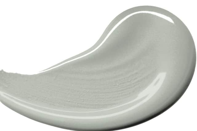
Now, the paint gurus have revealed their chosen hue for 2020 - the lyrically named ‘Tranquil Dawn’, a cool, hazy tone of green.

“A new decade heralds a new dawn, and the hazy pale green tones of Tranquil Dawn are calming and comforting, just when we need it most in our lives,” enthuses Marianne Shillingford, Dulux UK’s creative director.

Hide Ad
Hide Ad

And a lot of thought goes into choosing which shade gets the title, as it’s a question of timing as well as aesthetics.

Undated Handout Photo of Dulux Colour of the Year 2020 Tranquil Dawn (centre) and the Creativity Palette: Top Row (L-R): Chocolate Fountain, Heart Wood, Archive Paperl Middle (L-R): Dark Garnet, Neptune Seas, Forest Shade;Bottom Row (L-R): Sapphire Splendour, Burnished Brass, Stable Gates. See PA Feature INTERIORS Colour. Picture credit should read: Dulux/PA. WARNING: This picture must only be used to accompany PA Feature INTERIORS Colour. WARNING: This picture must only be used with the full product information as stated above.Undated Handout Photo of Dulux Colour of the Year 2020 Tranquil Dawn (centre) and the Creativity Palette: Top Row (L-R): Chocolate Fountain, Heart Wood, Archive Paperl Middle (L-R): Dark Garnet, Neptune Seas, Forest Shade;Bottom Row (L-R): Sapphire Splendour, Burnished Brass, Stable Gates. See PA Feature INTERIORS Colour. Picture credit should read: Dulux/PA. WARNING: This picture must only be used to accompany PA Feature INTERIORS Colour. WARNING: This picture must only be used with the full product information as stated above.
Undated Handout Photo of Dulux Colour of the Year 2020 Tranquil Dawn (centre) and the Creativity Palette: Top Row (L-R): Chocolate Fountain, Heart Wood, Archive Paperl Middle (L-R): Dark Garnet, Neptune Seas, Forest Shade;Bottom Row (L-R): Sapphire Splendour, Burnished Brass, Stable Gates. See PA Feature INTERIORS Colour. Picture credit should read: Dulux/PA. WARNING: This picture must only be used to accompany PA Feature INTERIORS Colour. WARNING: This picture must only be used with the full product information as stated above.

“This is a colour palette for wellbeing, which we very much need in our troubled, uncertain times,” Shillingford adds. “When we’re unsettled, we long to return to the familiar, and that’s embodied by nature-inspired colours which don’t demand too much of us, and help us feel peaceful and soothed.”

So what exactly is Tranquil Dawn all about?

“The new green palette is in tune with the interiors trend for strong green colours in the home, which has grown over the last couple of years,” explains Shillingford.

“We’ve dialled down those deep greens and instead created a softer, more gentle, smokier shade. This is a neutral colour which is easy to live with,” she adds.

Hide Ad
Hide Ad

“It pays a nod to the elements of the natural landscape, and you could describe it as the colour of the space between the land and the sky.”

Why did you choose Tranquil Dawn?

A team of expert judges, including former editor-in-chief of Elle Decoration magazine, Michelle Ogundehin, helped Dulux come to the decision on the colour.

“They found there was a growing desire to find our place in a world where advances in technology can make us feel increasingly disconnected from one another,” explains Shillingford.

“We actually see ‘green’ coming through in everything from political movements and environmental concerns, through to dietary choices like veganism.

Hide Ad
Hide Ad

“So this is a colour that reconnects us with nature, infusing rooms with a sense of calm, and is the perfect antidote to the pressure of our 24/7 digitised, full-on, sometimes manically busy world.”

How will it work in my home?

“It’s an easy colour to use, and ideal for people who are nervous about using colour in their homes.

“We’re generally a conservative bunch, so many people still have their reservations about bold colour, but Tranquil Dawn is so subtle and easy-on-the-eye,” says Shillingford.

“We feel it will work for everyone and every style.

“Rather than a stand-out feature colour, this is one which you could totally wrap around all the walls in a space and it would look absolutely beautiful.

Hide Ad
Hide Ad

“Alternatively, pairing it with neutral pastels or rich jewel shades can have a totally different impact.”

What are the different ways of using the colour of the year for 2020?

Dulux have also created four palettes - Meaning, Play, Creativity and Care - each designed to correspond with Tranquil Dawn, showing how the shade and various combinations can be used to create different moods and atmospheres.